Tout terminé, the project is over!
My coursework blog is now ready for assessment.
Thank you!
Thursday, 26 April 2012
Evaluation Question #4 Pt. 2
The technology available to us to use in the project was sufficient however I think that we would have liked to have available several other forms of technology which would have vastly benefited the quality of the final product.
We considered the option of filming in HD however the camera was not available, I think that filming in HD would've given a much slicker and overall better quality video which wouldn't have only benefited the video, but also the viewing audience and the quality of the print work imagery as these images were taken from the video.
We were able to make use of Web 2.0 features such as YouTube and Facebook to share our video with our audiences and Facebook was used in particular to gain feedback. This audience involvement was critical in understanding ways in which to improve our product(s).
During the process I think our creativity did improve, we had various ideas which developed potentially due to the feedback received from our audiences via the Facebook group.
Saturday, 21 April 2012
Evaluation Question #4
How did you use media technologies in the construction and research, planning
and evaluation stages?
The above presentation shows the different media technologies that we used during the development of our music video and accompanying print work.
How did you use media technologies in the construction and research, planning and evaluation stages? on Prezi
The above presentation shows the different media technologies that we used during the development of our music video and accompanying print work.
Evaluation Question #3
What have you learned from your audience feedback?
Audience feedback has come in useful throughout the project. Notably, receiving ideas on how to go forward with production, getting ideas from a target audience is a very good way of knowing how to address the audience and materialise a product that appeals to them, whilst also sufficiently promoting the band and their image.
Methods of getting audience feedback varied. Our primary approach of getting feedback was with our pitch; in presenting our idea and concepts to members of our audience and asking questions related to the continuation of the project.
I created a Facebook group in order to gain ideas concerning what people liked and what could have been improved with my print work. My audience also helped choose the typeface I was going to use on the magazine advert and digipak, this involved me posting an image of all the font options in my Facebook group, then receiving comments and/or votes for the font that looked best, best represented the band and promoted them appropriately, and which best represented or created a band image or visual style .
Mid-way through the process we toyed with the idea of changing our original idea of running a narrative video to a performance type video and our focus groups with members of our target audience really influenced our eventual decision to go ahead with our performance cut.
In creating our own Facebook groups and choosing people for our audience feedback sessions we were able to accurately represent the groups which we would expect to watch and enjoy our video, or at least people that we would like the video to appeal to. We ensured that our audience feedback was effective by receiving responses which were not simple one word, yes or no answers. We asked detailed questions which we received, for the majority, detailed responses to. These details really helped us to conceptualize, produce, and adjust our products accordingly.
Friday, 20 April 2012
Thursday, 19 April 2012
Friday, 13 April 2012
Developing the Magazine Ad
I learnt whilst analysing magazines that the bigger the band, the bigger the advert in the magazine. The very mainstream would get full page adverts while lesser-known, indie bands would get half a page.
For this reason I will be using half an A4-size canvas in Photoshop to design and make my magazine advert. This post will show my methods in how I made my advert.
My first step was to consider my inspiration; I decided on a 4x3 tile design on a black canvas of 210mm width by 148.5mm height. I was going to continue with the stripe/tile/block of colour design that I'd used with my digipak.

I started by colouring the background layer in black, then drawing three squares and copying them on four different layers to maintain size. I coloured two of these squares with colours that featured heavily on my digipak and then added photos of band members to feature on other tiles.
For this reason I will be using half an A4-size canvas in Photoshop to design and make my magazine advert. This post will show my methods in how I made my advert.
My first step was to consider my inspiration; I decided on a 4x3 tile design on a black canvas of 210mm width by 148.5mm height. I was going to continue with the stripe/tile/block of colour design that I'd used with my digipak.

I started by colouring the background layer in black, then drawing three squares and copying them on four different layers to maintain size. I coloured two of these squares with colours that featured heavily on my digipak and then added photos of band members to feature on other tiles.
Afterwards I considered the generic features of advertising material to add to my magazine. When it comes to promoting media it helps to add details of how audiences can buy the material, what publications related to it have reviewed it, how audiences can get involved with the artists, and so forth. I added basic details to some of the tiles, notably the title of the EP and artist name, then I added information regarding release dates, how to buy the EP and when, website and social media addresses, and brief review notes from two renouned music publications.
After I'd added this information I thought that it was important to make sure audiences would be aware of what the product looked like (despite offering a digital release on iTunes) so I filled the remaining four tiles with my digipak front cover.
I've submitted my magazine advert to my Facebook group and I'm receiving feedback on it. I may make changes to it yet but this is looking good as a first draft.
Finished Digipak Drafts
I've got three very similar ideas for a final digipak (differing only by stripe design on the cover and spine) and here they are below. I am consulting with my Facebook feedback group on which one to use; the current concensus is that the third design with stripes on the spine and extra white/grey on the cover is the best one to go with.
Getting Feedback
To receive feedback on typefaces, the video and the print work, I've set up a Facebook group which I've invited around 20 people to, so that I can receive comments and feedback from them to improve my work or make decisions on what to do.
Wednesday, 11 April 2012
Loophole
As I only have access to the video it's difficult for me to take away good quality images to put into the digipak.
So, using the power of Photoshop, I'll use render effects to manipulate these images into something different, so the lack of quality isn't as obvious, or even noticable at all.
Work continues...
So, using the power of Photoshop, I'll use render effects to manipulate these images into something different, so the lack of quality isn't as obvious, or even noticable at all.
Work continues...
Monday, 9 April 2012
Developing the Digipak
This post will show my methods in how I created my digipak.
I will be using Adobe Photoshop to create the digipak. My first step once opening the software was to open a canvas size that could cover all four panes and the spine in the right scale. After this, I pasted in and expanded my digipak layout image to cover the canvas to give me an idea of dimensions to work with on each pane.
 On the background layer I created a new layer onto which I pasted my layout image, which I can use to resize the images that I'll paste over the top later on. The image should read a canvas size of height 240mm and width 246.5mm, to accomodate the spine.
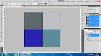
I chose to create and edit each pane's imagery individually on separate canvases of 120mm x 120mm, then once they were complete copy and paste them onto the layout sheet.
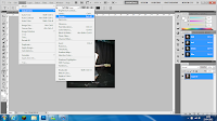
I wanted to use an image of each band member on the panes. For the front cover I wanted to use a striking three-colour stripe; but also a pattern relevant to our music video. Accordingly, I used a yellow, turquoise and red stripe which reflected the shirt choices of the three band members.
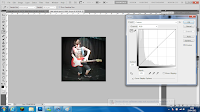 To adjust each image for the 3 panes; I used the Adjustments > Curves tool to alter the brightness, contrast, shadows and highlights. This left the images of both Sam and Jake in performance poses edited with improved brightness and contrast leaving them more visible, ready to be placed onto the template.
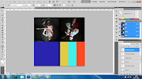 For the rear cover of my digipak I reviewed the video as I wanted to place a group shot of us all onto the digipak so all members of the "band" would be included. I edited a still of us three using the same method as before; Curves tool again used to improve the brightness and contrast without needing to use render effects which I considered to leave lighting effects which clashed with the lighting in the background of the photo.
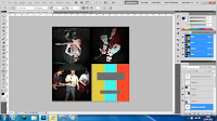
After this step I had all 4 panes of my digipak nearly complete. I had only the text of the front cover and spin (EP title and artist) and the rear cover (tracklisting and other generic digipak items) left to include.
I've put the text on the digipak but once I receive feedback from my font options I will change them accordingly. Also for overall feedback I will alter the looks of it to suit my target audience.
This is the first draft of my digipak:
I will be using Adobe Photoshop to create the digipak. My first step once opening the software was to open a canvas size that could cover all four panes and the spine in the right scale. After this, I pasted in and expanded my digipak layout image to cover the canvas to give me an idea of dimensions to work with on each pane.
 On the background layer I created a new layer onto which I pasted my layout image, which I can use to resize the images that I'll paste over the top later on. The image should read a canvas size of height 240mm and width 246.5mm, to accomodate the spine.
I chose to create and edit each pane's imagery individually on separate canvases of 120mm x 120mm, then once they were complete copy and paste them onto the layout sheet.

I wanted to use an image of each band member on the panes. For the front cover I wanted to use a striking three-colour stripe; but also a pattern relevant to our music video. Accordingly, I used a yellow, turquoise and red stripe which reflected the shirt choices of the three band members.
 To adjust each image for the 3 panes; I used the Adjustments > Curves tool to alter the brightness, contrast, shadows and highlights. This left the images of both Sam and Jake in performance poses edited with improved brightness and contrast leaving them more visible, ready to be placed onto the template.
 For the rear cover of my digipak I reviewed the video as I wanted to place a group shot of us all onto the digipak so all members of the "band" would be included. I edited a still of us three using the same method as before; Curves tool again used to improve the brightness and contrast without needing to use render effects which I considered to leave lighting effects which clashed with the lighting in the background of the photo.
After this step I had all 4 panes of my digipak nearly complete. I had only the text of the front cover and spin (EP title and artist) and the rear cover (tracklisting and other generic digipak items) left to include.
I've put the text on the digipak but once I receive feedback from my font options I will change them accordingly. Also for overall feedback I will alter the looks of it to suit my target audience.
This is the first draft of my digipak:
Potential Print Imagery
To find the right images for my digipak and magazine advert I will be watching our music video again, looking for appropriate stills. Ideally these still images will show the entirety or one member of the group with their guitar, drum kit or microphone.
Rather than using stills we have the option of capturing other images where we can specifically change the light settings and move into more photo-appropriate positions, however in the time we have left this will not be possible.
The still images, despite potentially lacking in print quality, will be suitable for print work as the images will be derived from the actual music video which uses a variety of camera shots and angles. The stand-out clothing choice of our group will stand out well in the otherwise dark setting of the stage, with only artificial spot lighting.
Here are some images which I could use for my print work:
Friday, 6 April 2012
Friday, 30 March 2012
Time Management #4
This is our time management document for March 2012.
Here is the original document and plan for the month.
During editing, it became apparent that our narrative edit wasn't of quality (as mentioned a while back) so we altered the video to a performance edit.
This required further filming and was therefore a set back. The adapated time management blocks compared to the original are shown here in yellow:
Typefaces
A typeface is a set of text and symbols which form a consistent design. Each typeface has its own way of visually representing characters and this representation can provoke different labels to items upon which the typeface is presented. Typefaces are similar to but not strictly identical to fonts.
These are some typefaces that I have previewed using dafont.com for potential use in my digipak and on my magazine advert. I chose to consider using these typefaces as I thought they best represented the genre of the band we are aiming to promote.
Each typeface is listed with its name and a sample of text, the name of the band. To help me decide which typeface to use on my digipak and magazine advert I will conduct some audience feedback.
Thursday, 29 March 2012
Digipak Layout and Dimensions
This is the layout and intended dimensions of the digipak that I will be working on shortly.
Each pane is a 120mm x 120mm square with the spine (print bleed considered) at 120mm length x 6.35mm width.
I will place the DVD into a sleeve rather than a typical plastic DVD holder. This sleeve will have the same dimensions as the other panes; though the elliptical-shape placed above it to form the sleeve will be 5mm shorter in width to accommodate room to easily remove and replace the DVD.
R&D Digipak Analysis: Black Keys - El Camino
This is the digipak release of El Camino, the seventh studio album release from American rock duo the Black Keys. It was released in December 2011.
The digipak is an eight pane (inc. reverse), with each pane carrying an image of a car, mainly large utility vehicles. The cover image is eponymous in that it displays the car (a Plymouth Grand Voyager) that the Black Keys first toured in.
The design, in its simplicity is fairly entropic. The design doesn't give a broad idea of the band's style but at the same time alludes to a sense of travel, road trips, the classic example of touring as a group, being on the road for days and not living a life of luxury before it all came good. This idea also became the centre point of the music video for the band's release of Gold On The Ceiling which was taken from this album. The preceeding magazine article to promote this album featured the very same vehicle on the cover, in the style of a faux newspaper ad, accompanied online by a parody commercial advertising the Black Keys' old tour van.
The disc is a bright turquoise colour with tracklisting, album title and band name and record label clearly displayed. Common conventions of digipaks are present despite the design being quite unique. Only in the inner sleeve is there a small booklet giving information about the album and the band, which all add up to create a fairly unique-to-the-Keys design. The rear pane shows the tracklisting, bar code and further information which you would usually find on album covers/similar digipaks.
Thursday, 22 March 2012
Thursday, 15 March 2012
Filming - Rough Cut
We have completed a first rough cut of our final performance-cut video:
We have carried out a focus group to tell us what they thought of the video.
We were told that our performance cut video was overall of a good quality and matched the target audience well. Our group said they would've perhaps liked to see some narrative scenes (which we had been working on previously but abandoned; we will reconsider this option.)
Friday, 2 March 2012
Filming - Actors/Crew
This is the crew for our upcoming music video. The three actors with performing roles in the music video and the cameraman who has sourced equipment are as follows:
Thursday, 1 March 2012
Plan B
After a focus group and internal group discussion we have come to the decision to drop the narrative edit. We came to this decision as we felt that the storyboard didn't give a sufficient storyline and the resultant video was lacking in quality; filming and editing a performance video would give us an overall better-looking product.
We will continue our project by filming more footage by returning to our college studio to film performance-video clips which will show each member of the band individually and then other clips to show the group on stage together.
We will continue our project by filming more footage by returning to our college studio to film performance-video clips which will show each member of the band individually and then other clips to show the group on stage together.
Thursday, 23 February 2012
Filming Update
Over the last two weeks we have successfully carried out several hours of filming for our eventual music video.
We have filmed the vast majority of scenes from the storyboards at the locations detailed in a previous blog post that were drawn up prior to this and are now set to start the editing process.
We have completed a focus group, the recorded footage of which shall be posted on the blog very soon. During this focus group and in group discussions which followed we have seriously considered changing course from a narrative music video to a more performance-based video sequence, though many elements of the idea will be carried forward; most notably costume.
Friday, 17 February 2012
Time Management #3
This is our working time management document for February 2012.
We aim to follow the work flow indicated by the dates on the calendar however this isn't always possible and some tasks may appear repeated from previous months as they didn't get done.
This month we had half term, and since we were not in college we had a week to organize a filming evening where we could meet up.
These are our previous timesheets:
December 2011
January 2012
Filming - Risk Assessment
Before we start filming our music video we must establish a risk assessment which will help us identify and prevent risks to safety or security.
Wednesday, 15 February 2012
Filming - Locations
We chose to film our performance element of the music video in the college’s drama studio. Here we had access to a large room with dismountable stage if we wanted to use it, a light set up which allowed us to alter the light of the room for different parts of the music.
We maintained used of our costumes and recorded a large performance video sequence on the stage. We were able to use a set of drums and a microphone owned by the college as well as a group member's (Sam) guitars.
In addition to the performance element other scenes from our narrative plan have been filmed in a variety of locations around Ludlow. These locations are pinpointed on the map below:
Filming - When?
So we can manage our time better around the other tasks as well as filming our music video, we have created a spreadsheet to show when the best times would be to meet up in our chosen locations and film.
The following timetable shows 90 minute slots during our college day with a gap from 12pm-1pm for lunch. Time spent filming or working on the music video out of college hours isn't shown on the following table.
Red blocks indicate the group member is busy in other college lessons, blue blocks denote their free time and the green blocks show the media lesson where we will spend time able to work collaboratively on the music video, this will include filming, editing, et cetera.
Tuesday, 14 February 2012
Filming - Costumes
The concept that had been decided upon was that of a story featuring three young men who act and dress socially awkwardly, behave in an arrogantly misdirected manner, with their actions not seen as acceptable and sociable to anybody else other than themselves.
These three guys will be wearing the following outfit:
- Vibrantly coloured/"Hawaiian" shirts
- Denim 3/4 lengths or shorts
- Pulled up, colourful socks
- Casual shoes
- Rayban-style retro sunglasses
This is Jake Vaughan and William Lloyd (L-R) modelling the chosen costume (coats not included)
These three guys will be wearing the following outfit:
- Vibrantly coloured/"Hawaiian" shirts
- Denim 3/4 lengths or shorts
- Pulled up, colourful socks
- Casual shoes
- Rayban-style retro sunglasses
This is Jake Vaughan and William Lloyd (L-R) modelling the chosen costume (coats not included)
Friday, 10 February 2012
Storyboard
This is a video timed to the track we are going to use that intends to show the sequence of clips.
Thursday, 2 February 2012
Magazine Adverts Analysis
The Maccabees - Given to the Wind
Q - February 2012
This advert is from the February 2012 issue of Q magazine and covers a full page on the rear cover. This is an advert for UK indie rock band the Maccabees' new album, Given to the Wild.
The image featuring so prominently is deceptively simplistic, showing an outdoor environment; acting as a prelude to the album which the advert is ultimately trying to sell. It is possible to interpret that the fire that burns the grass in the field alludes or connotes the 'wild' term used in the name of the album.
The album art is displayed fully in this advert, using contrasting colours of blue and orange, the difference between the sky and the fire. The typefaces used also contrast; with the Maccabees' logo shown at the top-centre of the page with a bold, white, sans serif typeface. Dissimilarly, the typeface used to show the name of the album and its release date, followed by a single short quote from NME magazine's review is a serif one, using regular width letters and italicised; used to highlight once again the contrast shown in the advert's palette and connote their indie rock style of music.
The small brick structure could reference something being given to or from the fire; a new life (a possible nod to a phoenix metaphor), but overall this can give a sense that the band is bringing out something new or a change from their usual style.
The Little Willies - For the Good Times
Q - February 2012
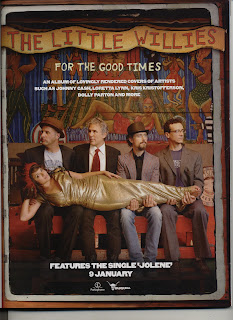
Released in January 2012, For the Good Times is the second studio album from American rock and country band the Little Willies. The album features solely covered songs by American artists, including Dolly Parton, Johnny Cash and appropriately to the band's moniker, Willie Nelson.
The band is featured on the face of the advert and Norah Jones who fronts the band is dressed in gold and lies across the four other members of the band. The differences in attire and the colours may connote a difference between the band members and musical styles.
 Goldfrapp - The Singles
Q - March 2012
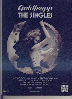
The magazine advert for Goldfrapp's The Singles has a somewhat entropic sense to it. The centre image features vocalist Alison Goldfrapp surrounded by various objects or scenes which may allude to themes that feature in their music.
Goldfrapp's musical style is considered to be electronic but the band has delved into various genres of music, such as glam rock, folk, ambient and synthpop. The range of images surrounding the centre image may connote this range and their music is characterized by uses of animals to describe human emotions. The masthead of the magazine advert is dominated by the band's logo and new album release title.
The variety of images surrounding the vocalist in the centre circular image may serve to compile every theme of songs that feature in the album.
Q - February 2012
This advert is from the February 2012 issue of Q magazine and covers a full page on the rear cover. This is an advert for UK indie rock band the Maccabees' new album, Given to the Wild.
The image featuring so prominently is deceptively simplistic, showing an outdoor environment; acting as a prelude to the album which the advert is ultimately trying to sell. It is possible to interpret that the fire that burns the grass in the field alludes or connotes the 'wild' term used in the name of the album.
The album art is displayed fully in this advert, using contrasting colours of blue and orange, the difference between the sky and the fire. The typefaces used also contrast; with the Maccabees' logo shown at the top-centre of the page with a bold, white, sans serif typeface. Dissimilarly, the typeface used to show the name of the album and its release date, followed by a single short quote from NME magazine's review is a serif one, using regular width letters and italicised; used to highlight once again the contrast shown in the advert's palette and connote their indie rock style of music.
The small brick structure could reference something being given to or from the fire; a new life (a possible nod to a phoenix metaphor), but overall this can give a sense that the band is bringing out something new or a change from their usual style.

The Little Willies - For the Good Times
Q - February 2012
Released in January 2012, For the Good Times is the second studio album from American rock and country band the Little Willies. The album features solely covered songs by American artists, including Dolly Parton, Johnny Cash and appropriately to the band's moniker, Willie Nelson.
The band is featured on the face of the advert and Norah Jones who fronts the band is dressed in gold and lies across the four other members of the band. The differences in attire and the colours may connote a difference between the band members and musical styles.
 Goldfrapp - The Singles
Q - March 2012
The magazine advert for Goldfrapp's The Singles has a somewhat entropic sense to it. The centre image features vocalist Alison Goldfrapp surrounded by various objects or scenes which may allude to themes that feature in their music.
Goldfrapp's musical style is considered to be electronic but the band has delved into various genres of music, such as glam rock, folk, ambient and synthpop. The range of images surrounding the centre image may connote this range and their music is characterized by uses of animals to describe human emotions. The masthead of the magazine advert is dominated by the band's logo and new album release title.
The variety of images surrounding the vocalist in the centre circular image may serve to compile every theme of songs that feature in the album.
Thursday, 26 January 2012
Pitch Focus Group
Here is our focus group which we carried out after showing our pitch to select members of a focus group.
Friday, 20 January 2012
Receiving Pitch Feedback
After our pitch we asked our audience (members of our class) what they thought of our pitch and concept. Responses were generally positive and we were provided with useful notes and feedback to improve or change our concept for our music video.
The questions asked were:
1) Does the concept work for you?
Responses to our primary question were very positive. The concept was described as 'original', 'good', 'funny', and that it 'fits well with the music and is easy to understand'. No members of our audience pointed out any fault with the concept.
2) Does our target audience match our music video concept?
Our audience profile was described as 'vague'. As a result we will better define our audience profile later on to potentially better match our concept. From feedback received we decided that our editing style would need to change to maintain interest from our viewers and our target audience.
3) Does our costume choice match our concept well?
We were concerned our first choice of costume of suits and balaclavas would be too entropic for the style of the video. We have since changed this costume choice, as our feedback gave us mixed responses. Some said that '[it would be] never too entropic, it will be funny' and 'it supports the concept', but others 'wouldn't look good if you were just walking the streets'.
4) Will the video be feasible? Are there any parts which you consider may be difficult?
Responses were generally positive and said that the video could be shot fairly easily however we would need to work on improving realism and authenticity by choosing film locations well.
5) Is our concept original?
Our concept primarily had solely narrative elements but we have since chosen to add performance elements in too. All responses back said the concept of the music video was original.
Thursday, 19 January 2012
Our Pitch
Our Pitch for our music video aims to cover details about the band and their influences, a potential target audience, and any inspirations we may like to incorporate into our final video.
Subscribe to:
Comments (Atom)


