As I only have access to the video it's difficult for me to take away good quality images to put into the digipak.
So, using the power of Photoshop, I'll use render effects to manipulate these images into something different, so the lack of quality isn't as obvious, or even noticable at all.
Work continues...
Wednesday, 11 April 2012
Monday, 9 April 2012
Developing the Digipak
This post will show my methods in how I created my digipak.
I will be using Adobe Photoshop to create the digipak. My first step once opening the software was to open a canvas size that could cover all four panes and the spine in the right scale. After this, I pasted in and expanded my digipak layout image to cover the canvas to give me an idea of dimensions to work with on each pane.
 On the background layer I created a new layer onto which I pasted my layout image, which I can use to resize the images that I'll paste over the top later on. The image should read a canvas size of height 240mm and width 246.5mm, to accomodate the spine.
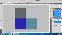
I chose to create and edit each pane's imagery individually on separate canvases of 120mm x 120mm, then once they were complete copy and paste them onto the layout sheet.
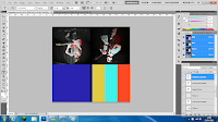
I wanted to use an image of each band member on the panes. For the front cover I wanted to use a striking three-colour stripe; but also a pattern relevant to our music video. Accordingly, I used a yellow, turquoise and red stripe which reflected the shirt choices of the three band members.
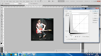 To adjust each image for the 3 panes; I used the Adjustments > Curves tool to alter the brightness, contrast, shadows and highlights. This left the images of both Sam and Jake in performance poses edited with improved brightness and contrast leaving them more visible, ready to be placed onto the template.
 For the rear cover of my digipak I reviewed the video as I wanted to place a group shot of us all onto the digipak so all members of the "band" would be included. I edited a still of us three using the same method as before; Curves tool again used to improve the brightness and contrast without needing to use render effects which I considered to leave lighting effects which clashed with the lighting in the background of the photo.
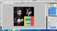
After this step I had all 4 panes of my digipak nearly complete. I had only the text of the front cover and spin (EP title and artist) and the rear cover (tracklisting and other generic digipak items) left to include.
I've put the text on the digipak but once I receive feedback from my font options I will change them accordingly. Also for overall feedback I will alter the looks of it to suit my target audience.
This is the first draft of my digipak:

I will be using Adobe Photoshop to create the digipak. My first step once opening the software was to open a canvas size that could cover all four panes and the spine in the right scale. After this, I pasted in and expanded my digipak layout image to cover the canvas to give me an idea of dimensions to work with on each pane.
 On the background layer I created a new layer onto which I pasted my layout image, which I can use to resize the images that I'll paste over the top later on. The image should read a canvas size of height 240mm and width 246.5mm, to accomodate the spine.
I chose to create and edit each pane's imagery individually on separate canvases of 120mm x 120mm, then once they were complete copy and paste them onto the layout sheet.

I wanted to use an image of each band member on the panes. For the front cover I wanted to use a striking three-colour stripe; but also a pattern relevant to our music video. Accordingly, I used a yellow, turquoise and red stripe which reflected the shirt choices of the three band members.
 To adjust each image for the 3 panes; I used the Adjustments > Curves tool to alter the brightness, contrast, shadows and highlights. This left the images of both Sam and Jake in performance poses edited with improved brightness and contrast leaving them more visible, ready to be placed onto the template.
 For the rear cover of my digipak I reviewed the video as I wanted to place a group shot of us all onto the digipak so all members of the "band" would be included. I edited a still of us three using the same method as before; Curves tool again used to improve the brightness and contrast without needing to use render effects which I considered to leave lighting effects which clashed with the lighting in the background of the photo.
After this step I had all 4 panes of my digipak nearly complete. I had only the text of the front cover and spin (EP title and artist) and the rear cover (tracklisting and other generic digipak items) left to include.
I've put the text on the digipak but once I receive feedback from my font options I will change them accordingly. Also for overall feedback I will alter the looks of it to suit my target audience.
This is the first draft of my digipak:

Potential Print Imagery
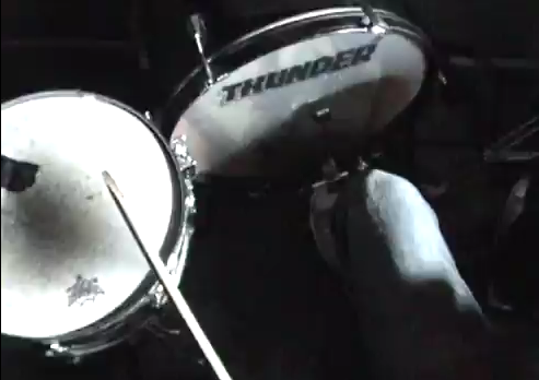
To find the right images for my digipak and magazine advert I will be watching our music video again, looking for appropriate stills. Ideally these still images will show the entirety or one member of the group with their guitar, drum kit or microphone.
Rather than using stills we have the option of capturing other images where we can specifically change the light settings and move into more photo-appropriate positions, however in the time we have left this will not be possible.
The still images, despite potentially lacking in print quality, will be suitable for print work as the images will be derived from the actual music video which uses a variety of camera shots and angles. The stand-out clothing choice of our group will stand out well in the otherwise dark setting of the stage, with only artificial spot lighting.
Here are some images which I could use for my print work:


Friday, 6 April 2012
Time Management #5
This is the time management document for April 2012, where we will end the project.


Friday, 30 March 2012
Time Management #4
This is our time management document for March 2012.
Here is the original document and plan for the month.

During editing, it became apparent that our narrative edit wasn't of quality (as mentioned a while back) so we altered the video to a performance edit.
This required further filming and was therefore a set back. The adapated time management blocks compared to the original are shown here in yellow:

Typefaces
A typeface is a set of text and symbols which form a consistent design. Each typeface has its own way of visually representing characters and this representation can provoke different labels to items upon which the typeface is presented. Typefaces are similar to but not strictly identical to fonts.
These are some typefaces that I have previewed using dafont.com for potential use in my digipak and on my magazine advert. I chose to consider using these typefaces as I thought they best represented the genre of the band we are aiming to promote.

Each typeface is listed with its name and a sample of text, the name of the band. To help me decide which typeface to use on my digipak and magazine advert I will conduct some audience feedback.
Thursday, 29 March 2012
Digipak Layout and Dimensions

This is the layout and intended dimensions of the digipak that I will be working on shortly.
Each pane is a 120mm x 120mm square with the spine (print bleed considered) at 120mm length x 6.35mm width.
I will place the DVD into a sleeve rather than a typical plastic DVD holder. This sleeve will have the same dimensions as the other panes; though the elliptical-shape placed above it to form the sleeve will be 5mm shorter in width to accommodate room to easily remove and replace the DVD.
R&D Digipak Analysis: Black Keys - El Camino

This is the digipak release of El Camino, the seventh studio album release from American rock duo the Black Keys. It was released in December 2011.
The digipak is an eight pane (inc. reverse), with each pane carrying an image of a car, mainly large utility vehicles. The cover image is eponymous in that it displays the car (a Plymouth Grand Voyager) that the Black Keys first toured in.
The design, in its simplicity is fairly entropic. The design doesn't give a broad idea of the band's style but at the same time alludes to a sense of travel, road trips, the classic example of touring as a group, being on the road for days and not living a life of luxury before it all came good. This idea also became the centre point of the music video for the band's release of Gold On The Ceiling which was taken from this album. The preceeding magazine article to promote this album featured the very same vehicle on the cover, in the style of a faux newspaper ad, accompanied online by a parody commercial advertising the Black Keys' old tour van.
The disc is a bright turquoise colour with tracklisting, album title and band name and record label clearly displayed. Common conventions of digipaks are present despite the design being quite unique. Only in the inner sleeve is there a small booklet giving information about the album and the band, which all add up to create a fairly unique-to-the-Keys design. The rear pane shows the tracklisting, bar code and further information which you would usually find on album covers/similar digipaks.

Thursday, 22 March 2012
Thursday, 15 March 2012
Filming - Rough Cut
We have completed a first rough cut of our final performance-cut video:
We have carried out a focus group to tell us what they thought of the video.
We were told that our performance cut video was overall of a good quality and matched the target audience well. Our group said they would've perhaps liked to see some narrative scenes (which we had been working on previously but abandoned; we will reconsider this option.)
Subscribe to:
Posts (Atom)