
Saturday, 21 April 2012
Friday, 20 April 2012
Thursday, 19 April 2012

Friday, 13 April 2012
Developing the Magazine Ad
I learnt whilst analysing magazines that the bigger the band, the bigger the advert in the magazine. The very mainstream would get full page adverts while lesser-known, indie bands would get half a page.
For this reason I will be using half an A4-size canvas in Photoshop to design and make my magazine advert. This post will show my methods in how I made my advert.
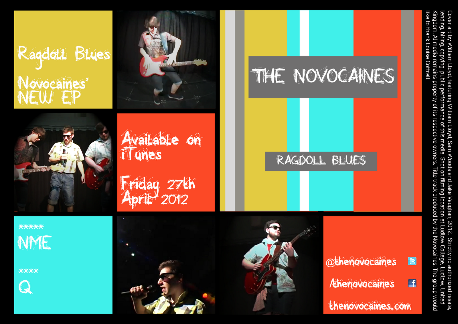
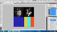
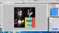
My first step was to consider my inspiration; I decided on a 4x3 tile design on a black canvas of 210mm width by 148.5mm height. I was going to continue with the stripe/tile/block of colour design that I'd used with my digipak.

I started by colouring the background layer in black, then drawing three squares and copying them on four different layers to maintain size. I coloured two of these squares with colours that featured heavily on my digipak and then added photos of band members to feature on other tiles.


For this reason I will be using half an A4-size canvas in Photoshop to design and make my magazine advert. This post will show my methods in how I made my advert.
My first step was to consider my inspiration; I decided on a 4x3 tile design on a black canvas of 210mm width by 148.5mm height. I was going to continue with the stripe/tile/block of colour design that I'd used with my digipak.

I started by colouring the background layer in black, then drawing three squares and copying them on four different layers to maintain size. I coloured two of these squares with colours that featured heavily on my digipak and then added photos of band members to feature on other tiles.


Afterwards I considered the generic features of advertising material to add to my magazine. When it comes to promoting media it helps to add details of how audiences can buy the material, what publications related to it have reviewed it, how audiences can get involved with the artists, and so forth. I added basic details to some of the tiles, notably the title of the EP and artist name, then I added information regarding release dates, how to buy the EP and when, website and social media addresses, and brief review notes from two renouned music publications.
After I'd added this information I thought that it was important to make sure audiences would be aware of what the product looked like (despite offering a digital release on iTunes) so I filled the remaining four tiles with my digipak front cover.


I've submitted my magazine advert to my Facebook group and I'm receiving feedback on it. I may make changes to it yet but this is looking good as a first draft.
Finished Digipak Drafts
I've got three very similar ideas for a final digipak (differing only by stripe design on the cover and spine) and here they are below. I am consulting with my Facebook feedback group on which one to use; the current concensus is that the third design with stripes on the spine and extra white/grey on the cover is the best one to go with.


Getting Feedback
To receive feedback on typefaces, the video and the print work, I've set up a Facebook group which I've invited around 20 people to, so that I can receive comments and feedback from them to improve my work or make decisions on what to do.


Wednesday, 11 April 2012
Loophole
As I only have access to the video it's difficult for me to take away good quality images to put into the digipak.
So, using the power of Photoshop, I'll use render effects to manipulate these images into something different, so the lack of quality isn't as obvious, or even noticable at all.
Work continues...
So, using the power of Photoshop, I'll use render effects to manipulate these images into something different, so the lack of quality isn't as obvious, or even noticable at all.
Work continues...
Monday, 9 April 2012
Developing the Digipak
This post will show my methods in how I created my digipak.
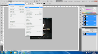
I will be using Adobe Photoshop to create the digipak. My first step once opening the software was to open a canvas size that could cover all four panes and the spine in the right scale. After this, I pasted in and expanded my digipak layout image to cover the canvas to give me an idea of dimensions to work with on each pane.
 On the background layer I created a new layer onto which I pasted my layout image, which I can use to resize the images that I'll paste over the top later on. The image should read a canvas size of height 240mm and width 246.5mm, to accomodate the spine.
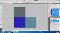
I chose to create and edit each pane's imagery individually on separate canvases of 120mm x 120mm, then once they were complete copy and paste them onto the layout sheet.
I wanted to use an image of each band member on the panes. For the front cover I wanted to use a striking three-colour stripe; but also a pattern relevant to our music video. Accordingly, I used a yellow, turquoise and red stripe which reflected the shirt choices of the three band members.
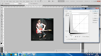 To adjust each image for the 3 panes; I used the Adjustments > Curves tool to alter the brightness, contrast, shadows and highlights. This left the images of both Sam and Jake in performance poses edited with improved brightness and contrast leaving them more visible, ready to be placed onto the template.
 For the rear cover of my digipak I reviewed the video as I wanted to place a group shot of us all onto the digipak so all members of the "band" would be included. I edited a still of us three using the same method as before; Curves tool again used to improve the brightness and contrast without needing to use render effects which I considered to leave lighting effects which clashed with the lighting in the background of the photo.
After this step I had all 4 panes of my digipak nearly complete. I had only the text of the front cover and spin (EP title and artist) and the rear cover (tracklisting and other generic digipak items) left to include.
I've put the text on the digipak but once I receive feedback from my font options I will change them accordingly. Also for overall feedback I will alter the looks of it to suit my target audience.
This is the first draft of my digipak:

I will be using Adobe Photoshop to create the digipak. My first step once opening the software was to open a canvas size that could cover all four panes and the spine in the right scale. After this, I pasted in and expanded my digipak layout image to cover the canvas to give me an idea of dimensions to work with on each pane.
 On the background layer I created a new layer onto which I pasted my layout image, which I can use to resize the images that I'll paste over the top later on. The image should read a canvas size of height 240mm and width 246.5mm, to accomodate the spine.
I chose to create and edit each pane's imagery individually on separate canvases of 120mm x 120mm, then once they were complete copy and paste them onto the layout sheet.

I wanted to use an image of each band member on the panes. For the front cover I wanted to use a striking three-colour stripe; but also a pattern relevant to our music video. Accordingly, I used a yellow, turquoise and red stripe which reflected the shirt choices of the three band members.
 To adjust each image for the 3 panes; I used the Adjustments > Curves tool to alter the brightness, contrast, shadows and highlights. This left the images of both Sam and Jake in performance poses edited with improved brightness and contrast leaving them more visible, ready to be placed onto the template.
 For the rear cover of my digipak I reviewed the video as I wanted to place a group shot of us all onto the digipak so all members of the "band" would be included. I edited a still of us three using the same method as before; Curves tool again used to improve the brightness and contrast without needing to use render effects which I considered to leave lighting effects which clashed with the lighting in the background of the photo.
After this step I had all 4 panes of my digipak nearly complete. I had only the text of the front cover and spin (EP title and artist) and the rear cover (tracklisting and other generic digipak items) left to include.
I've put the text on the digipak but once I receive feedback from my font options I will change them accordingly. Also for overall feedback I will alter the looks of it to suit my target audience.
This is the first draft of my digipak:

Potential Print Imagery
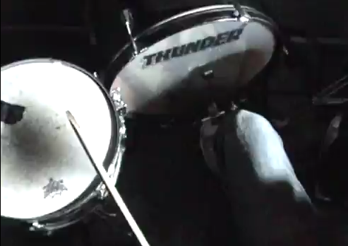
To find the right images for my digipak and magazine advert I will be watching our music video again, looking for appropriate stills. Ideally these still images will show the entirety or one member of the group with their guitar, drum kit or microphone.
Rather than using stills we have the option of capturing other images where we can specifically change the light settings and move into more photo-appropriate positions, however in the time we have left this will not be possible.
The still images, despite potentially lacking in print quality, will be suitable for print work as the images will be derived from the actual music video which uses a variety of camera shots and angles. The stand-out clothing choice of our group will stand out well in the otherwise dark setting of the stage, with only artificial spot lighting.
Here are some images which I could use for my print work:


Friday, 6 April 2012
Time Management #5
This is the time management document for April 2012, where we will end the project.


Subscribe to:
Posts (Atom)